


Some factors on our testing scale when showing the current design:
Visual appeal, Overwhelmingness, Outdated/ Modern, Generic / Unique
There were more which I haven't included to keep this case study short.
What stood out:
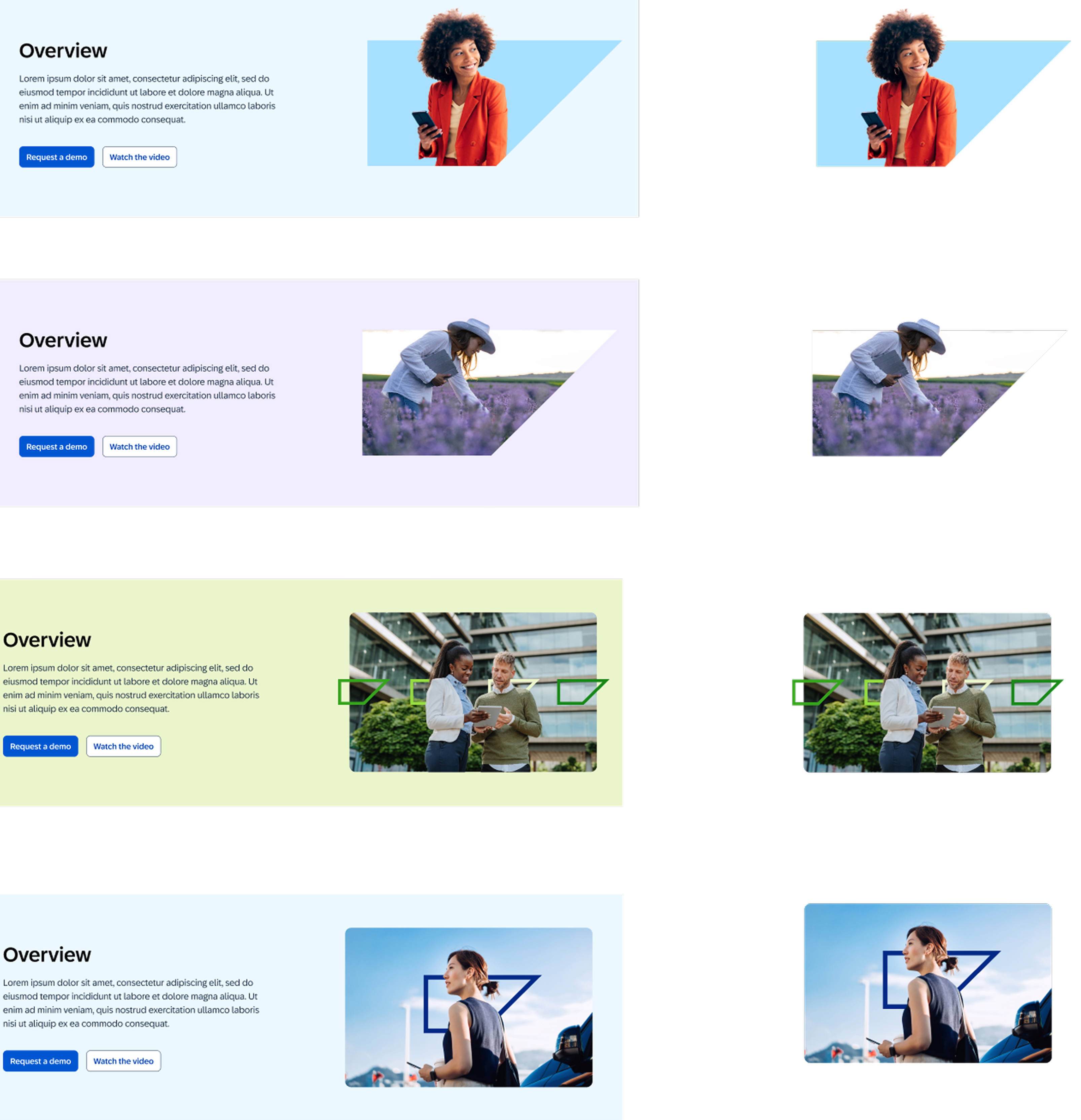
Photography of people didn't make much sense when associated with products.
Some of the images seem outdated.
Would prefer seeing product screenshots.
Patterned backgrounds did not test well.
When it came to color:
Users wanted to see more color not just a singular one.
The whole test results was compiled into a set of recommendations
(Not shown due to NDA)
Based on the recommendations - we started with photography and then delved into making visual templates for the components.